Introduction
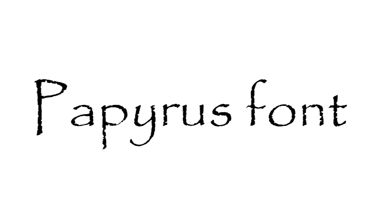
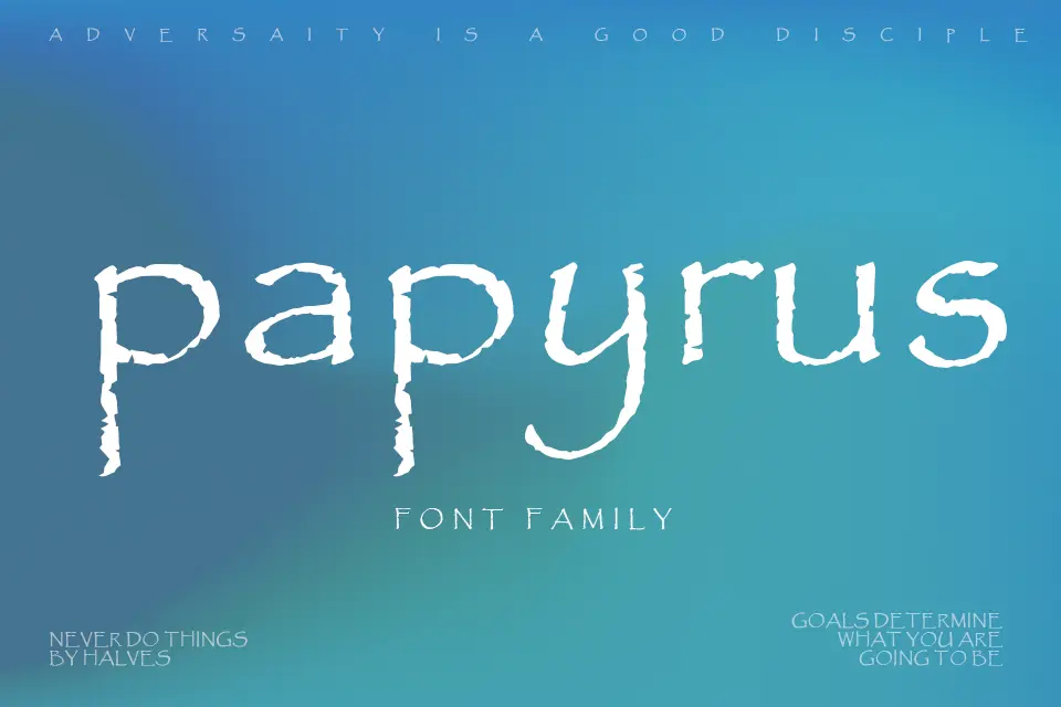
The Papyrus font is one of the most recognizable and polarizing typefaces in modern design. Known for its rustic, hand-drawn appearance, it has been widely used in branding, logos, and creative projects. However, it has also faced significant criticism for being overused and lacking versatility.
In this article, we will explore the history of the Papyrus font, its design characteristics, common applications, and the controversies surrounding it. Whether you love it or hate it, there’s no denying that Papyrus font has left a lasting impact on typography.
The History of Papyrus Font
Who Created the Papyrus Font?
The Papyrus font was designed in 1982 by Chris Costello, a graphic designer and illustrator. At the time, Costello was only 23 years old and created the font as an experiment, inspired by ancient calligraphy and biblical manuscripts.
The font was intended to mimic the look of handwritten text on papyrus paper, an early form of paper used in ancient Egypt. Costello wanted to capture the organic, irregular strokes of natural handwriting, giving the font its distinctive rough, uneven edges.
How Did Papyrus Font Become Popular?
Initially, Papyrus font was distributed through Letraset, a company that produced dry-transfer lettering. Later, it was digitized and included in various font libraries, making it widely accessible.
Its popularity skyrocketed in the 1980s and 1990s when it became a default font on many personal computers, particularly on Apple’s macOS. Because it was free and visually distinct, designers and businesses began using it for logos, invitations, and advertisements.
Design Characteristics of Papyrus Font
The Papyrus font has several unique design elements that set it apart from other typefaces:
1. Handwritten, Organic Feel
- The letters have uneven edges, resembling ink on textured paper.
- The strokes vary in thickness, giving it a natural, imperfect look.
2. Serif-Like Details
- While technically a sans-serif font, Papyrus has small flares at the ends of some strokes, similar to serifs.
- These details add to its ancient, historical aesthetic.
3. Uppercase and Lowercase Variations
- The uppercase letters are bold and prominent.
- The lowercase letters are more delicate, with subtle curves.
4. Limited Kerning and Spacing
- Due to its irregular design, Papyrus font can sometimes appear cramped or uneven in long texts.
- This makes it less suitable for body text but ideal for short headlines or logos.
Common Uses of Papyrus Font
Despite its mixed reputation, Papyrus font has been used in many high-profile applications:
1. Branding and Logos
- James Cameron’s Avatar (2009) – The movie’s logo famously used Papyrus, sparking both admiration and mockery.
- Restaurants and Cafés – Many organic, ethnic, or spiritual businesses use Papyrus to convey a handmade, authentic feel.
- Spiritual and Wellness Brands – Yoga studios, meditation centers, and holistic health brands often choose Papyrus for its earthy, mystical vibe.
2. Event Invitations and Greeting Cards
- Due to its elegant yet casual appearance, Papyrus is frequently used for:
- Wedding invitations
- Birthday cards
- Religious ceremonies
3. Book Covers and Posters
- Fantasy and historical novels sometimes use Papyrus for titles to evoke an ancient or mythical atmosphere.
- Movie posters, especially for period dramas or adventure films, have employed this font.
Why Is Papyrus Font So Controversial?
While Papyrus font has its fans, it has also become a subject of ridicule in the design community. Here’s why:
1. Overuse and Lack of Originality
- Because it was free and readily available, many amateur designers used it excessively in the 1990s and early 2000s.
- This led to a saturation effect, making it seem cliché and unoriginal.
2. Poor Legibility in Long Texts
- The irregular strokes and uneven spacing make it hard to read in paragraphs.
- Designers argue that it should only be used for short, decorative text.
3. The “Avatar” Backlash
- When James Cameron’s Avatar used Papyrus for its multi-billion-dollar franchise logo, designers were outraged.
- Many felt that a high-budget film should have commissioned a custom font instead of relying on a default typeface.
- Saturday Night Live (SNL) even mocked this in a 2017 skit where Ryan Gosling played a graphic designer obsessed with Avatar’s font choice.
4. Association with Amateur Design
- Because of its overuse in low-budget projects, Papyrus is often seen as a “lazy” design choice.
- Professional designers typically avoid it in favor of more refined alternatives.
Alternatives to Papyrus Font
If you like the style of Papyrus but want something more unique, here are some great alternatives:
1. Riven – A more polished version of Papyrus with smoother edges.
2. Trajan Pro – A classic serif font with an ancient Roman feel.
3. Blackadder ITC – A calligraphic font with a historical aesthetic.
4. Mistral – A flowing, handwritten script with a casual elegance.
5. Parchment – Mimics old manuscript text without Papyrus’s roughness.
Should You Use Papyrus Font in 2024?
The debate over Papyrus font continues, but here’s a balanced perspective:
When to Use Papyrus:
✅ Short, decorative headlines (e.g., logos, invitations)
✅ Projects needing an “ancient” or “organic” vibe
✅ Personal or artistic designs where creativity matters more than professionalism
When to Avoid Papyrus:
❌ Long paragraphs or body text (legibility issues)
❌ Corporate or high-end branding (can appear unprofessional)
❌ Trendy, modern designs (Papyrus feels outdated in sleek contexts)
Conclusion
The Papyrus font remains one of the most debated typefaces in design history. Loved for its handcrafted charm and criticized for its overuse, it continues to spark strong opinions.
Whether you embrace it or avoid it, understanding its history, strengths, and weaknesses can help you make informed typography choices. If used thoughtfully, Papyrus font can still add a unique touch to creative projects—but in moderation.
What’s your take on Papyrus font? Do you think it deserves its bad reputation, or is it an underrated classic? Let us know in the comments!
you may also read ultranewstime.